- HOME
- CI Guideline
About the Symbol Mark

The symbol mark depicts the initials of our company name, “S” and “D,” stylized as a single line. The single line represents our consistent journey forward into the future, together with UV technology.
The dashed lines in the flowing shape of “S” are inspired by the name “Sankyo,” embodying the concept of continuity into the future. The fluid design of the “S” reflects our adaptability to change while pursuing sustainable growth.
The dashed portion symbolizes the continuity from past to future, while the overall design expresses the strength of a “forward-moving company.”
The colors combine purple, inspired by UV lamps, and blue, symbolizing trust, to convey our corporate image. Purple signifies advanced technology and expertise, while blue represents trust and integrity.
This combination of colors highlights the harmony of innovation and trust, establishing a unified visual identity that extends across our entire brand.
Brand logo/mark basic form

Symbol mark
Logo type
Logo type
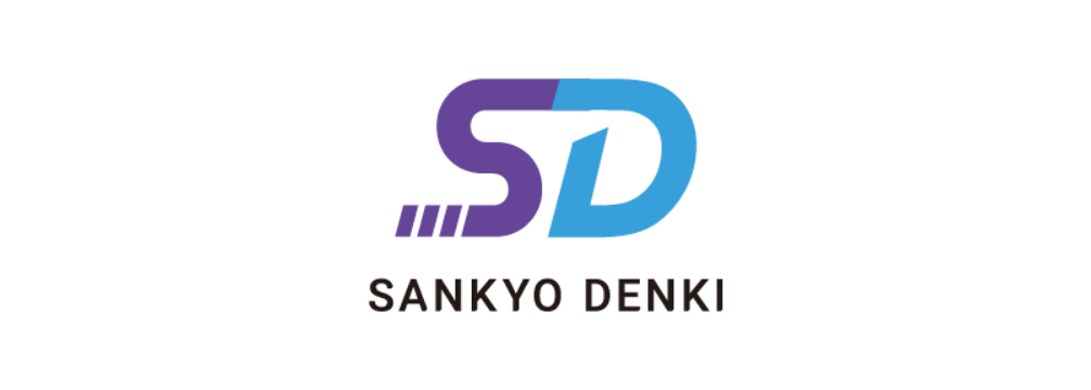
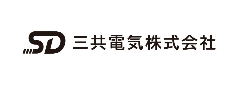
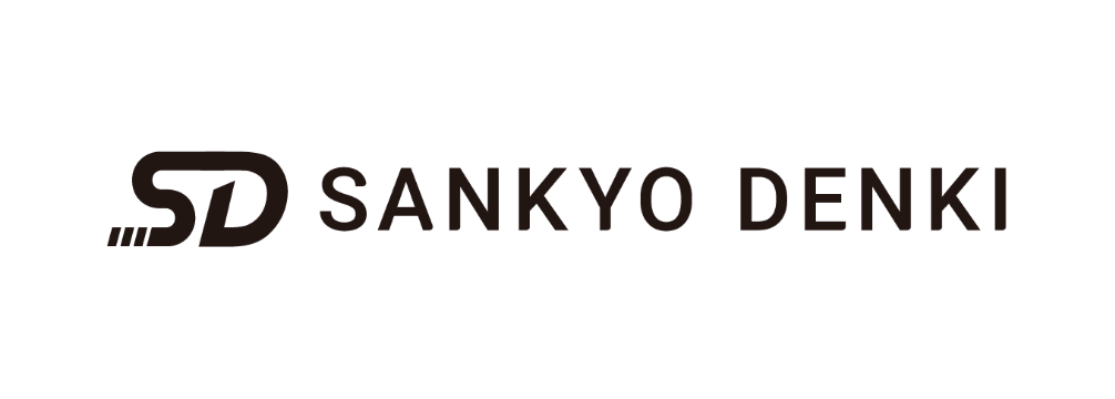
Symbol mark+Logo type / Horizon
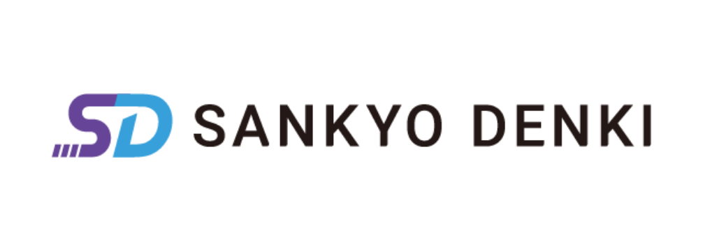
Symbol mark+Logo type / Horizon
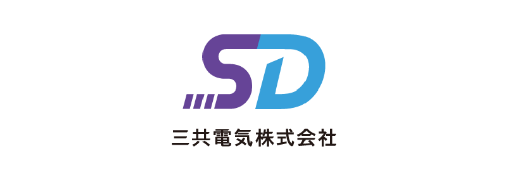
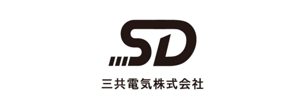
Symbol mark+Logo type / Square
Symbol mark+Logo type / Square
Color options
Black
Symbol mark+Logo type / Horizon
Symbol mark+Logo type / Horizon
Symbol mark+Logo type / Square
Symbol mark+Logo type / Square
Corporate color
Symbol mark+Logo type / Horizon
Symbol mark+Logo type / Horizon
Symbol mark+Logo type / Square
Symbol mark+Logo type / Square
White
Symbol mark+Logo type / Horizon
Symbol mark+Logo type / Horizon
Symbol mark+Logo type / Square
Symbol mark+Logo type / Square
Color regulations
Color base
- [ RGB ] R: 102 G: 68 B:151 #664497
[ CMYK ] C:70 M: 80 Y: 0 K:0
[ PANTONE ] 266C
[ DIC ] 187 - [ RGB ] R: 55 G: 160 B:218 #37A0DA
[ CMYK ] C:70 M:20 Y: 0 K:0
[ PANTONE ] 306C
[ DIC ] 2177 - [ RGB ] R: 0 G: 0 B:0 #000000
[ CMYK ] C:0 M:0 Y: 0 K:100
[ PANTONE ] P-BlackC
Background control
The visibility of the logo may be compromised depending on the brightness of the background.
To ensure visibility and readability, please adjust the logo to match the brightness of the background.
0%
25%
70%
100%
0%
25%
70%
100%
Isolation zone and minimum size
Isolation zone
We require an “isolation zone” for the logo in order to maintain its visibility and independence.
No other elements may be placed within the isolation zone.
Further, the logo may not be used below the minimum size as sufficient readability cannot be assured.
Minimum size
Prohibited acts
None of the files provide for download by Sankyo Denki may be altered or modified.
The following uses are prohibited: